

How to expertly combine colour in your home Part 1
Welcome! So first off congratulations on taking this initial step into discovering how to bring more colour into your life. I am going to walk you through the basics of colour theory how to combine colours and how to make your colour schemes interesting.
We use colour to express ourselves and to some extent we are manipulated by colour. It can influence how we feel emotionally and physically so choosing the right colours goes a long way to creating the right atmosphere in your home.

Colour wheel
Newton invented the colour wheel which makes it easy to understand the relationship between colours.
There are Complementary colours which are opposite each other on the colour wheel and not necessarily colours that go well together. They offer a strong contrast; they make each other vibrate so should in my opinion be used sparingly.
Analogous colours are neighbouring colours on the wheel yellow-greens, greens and blue-greens for example and as they reflect similar light waves, we find them harmonious.
From an interior design perspective the effect of the colour will also depend on the amount used, the intensity of the colour and how and where it is used.
The final thing to know before we look at combining colours in a scheme, are the properties of colour. First off, the hue is the way we describe colour, - btw black, whites and greys are neutrals, not colours. The tone refers to the lightness or darkness of a colour and the saturation to the intensity of the colour. Still with me? Let’s move on to how to combine them….

Monochrome interior - Designers Guild
Monochrome interiors are those using varying shades of one colour. For example, a neutral scheme would be monochromatic, although it could be any colour such as blue (see here). The advantages are that it is easy to create and can be calming, the disadvantage is that it can be quite monotonous.
To make this scheme more interesting go for different tones of the same colour, introduce texture and mixed dull/shiny surfaces. Wood is also a neutral.

Analagous interior - Sasha Bikoff
Analogous colours: Is when you chose colours adjacent to each other on the colour wheel such as greens and blues or yellows, oranges and pinks. Avoid choosing warm and cold colours that may be next to each other.
Choose one colour as the dominant colour.
The advantage of this scheme is that it is richer and more varied than the monochrome schemes, but the disadvantage is that without any complementary colours it can read as quite flat.
Complementary harmony
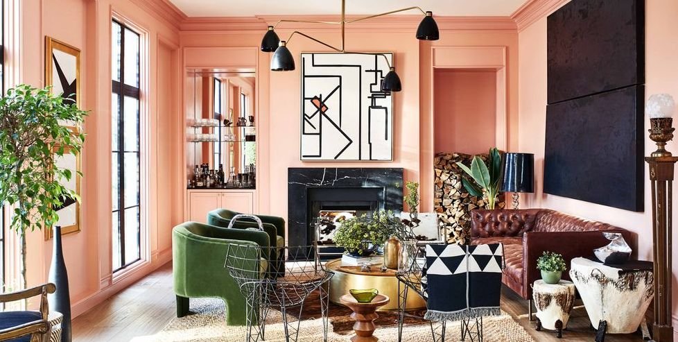
Complementary harmony: Colours on opposite sides of the colour wheel. If these are both strong colours you can risk ending up with a scheme that is a bit “play-school”. I suggest choosing one as the dominant colour and using the other as an accent. The advantage is that they always go together, the disadvantage is that because the combination can be quite attention seeking you need to have a deft handling of harmony and balance. Look at this example of blues and yellows, you could choose a bold colour from one part of the colour wheel and a lighter colour from the complementary family
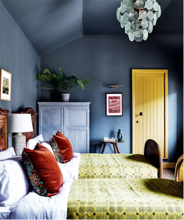
Triadic harmony by Pure & Original paint
Triadic harmony: This involves using 3 hues equidistant from each other on the colour wheel. This is a popular one with designers as it is strong yet balanced. As before the best option is chose one as the dominant colour and make the other two secondary colours.
The advantages of this combination are that the scheme will have great harmony.
The disadvantage is that some combinations could look gaudy so look to tone down the colours. This image below shows mustard, lilac and pale pink. The mustard is the dominant colour and the pale pink and lilac the secondary colours.
These next two are my favourite and the most expert ways to combine colours….

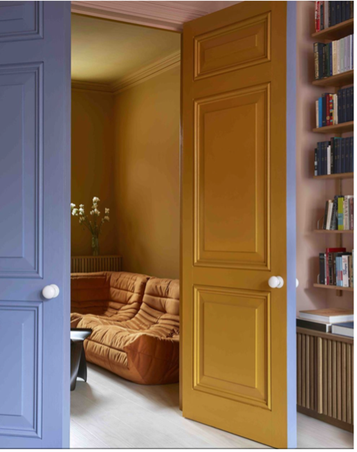
Split complementary - Future
Split Complementary: It uses 3 colours, two colours that are nearly adjacent to each other and the complement of the colour in-between them,. So, for example blue, red and pink.
Advantage is there is a strong contrast but with harmony, disadvantage can be tricky to balance.
Double complementary: Involves using two adjacent or near adjacent colours on the colour wheel and their complements, ie blue and green and orange and pink.
This is the hardest scheme, but it has the most colour variety and offers the ability to harmoniously mix warm and cool colours. I LOVE IT and have used it extensively in my own home.
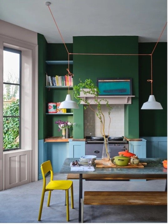
Double complementary - Farrow & Ball
Hopefully this blog has given you the confidence to get started combining colours in your home. Follow me to ensure you don’t miss the next blog in the series which will be on “How to use colour to manipulate spaces and using colour in practice”.
If you would like some expert help on introducing colour to your home, drop me a line on tania@taniadaviesdesign.com